As part of our project to make the Commtap resources site more accessible to parents of children with communication difficulties, we are developing the site to make it work well on mobile phones.
Here we show you what the new mobile version of the site could look like. This is how the site would appear on small screens, we are not changing the site for larger screens such as desktops and laptops.
Have a look through, and please do send us your comments (positive as well as negative please!)
Home page
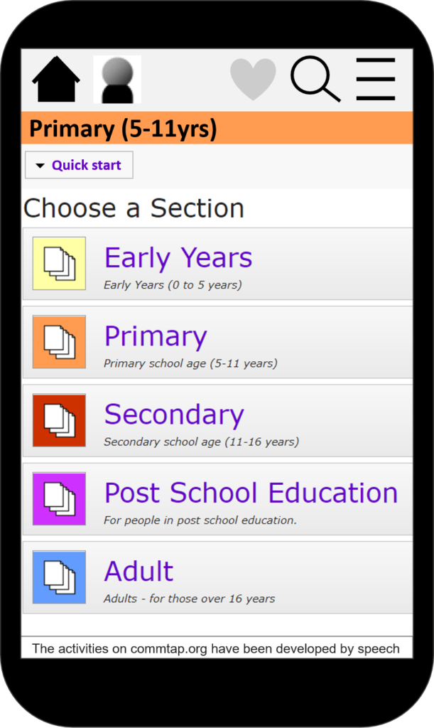
Every page will have a new bar at the top with links to the home page, login, favourite a page (heart icon), search, and menu (three lines you tap on to get the menu).
Search
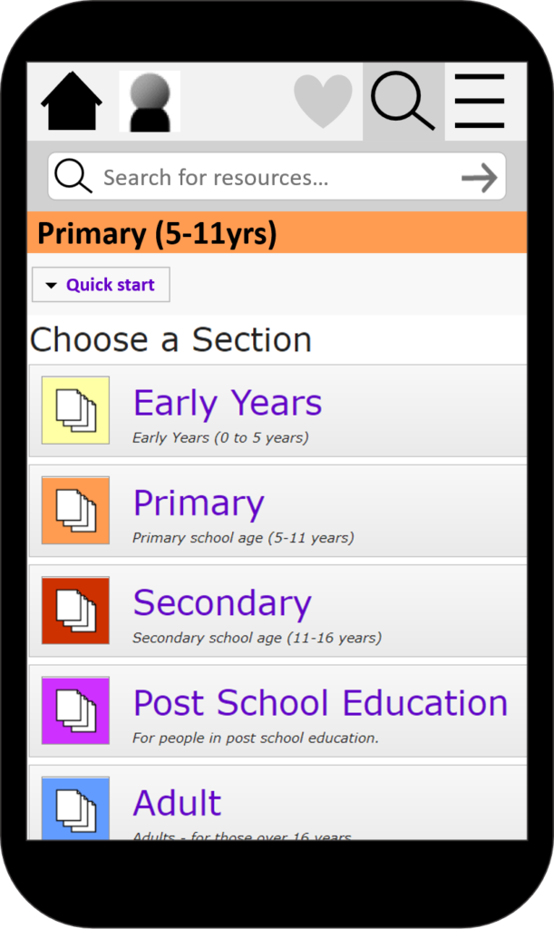
If you tap on the search icon, the search box will be shown:
Search results
The search results will look like this:
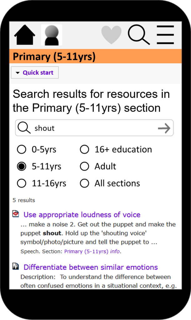
You will be able to scroll down the list of results. You will be able to choose a particular section of the site to search in, or the whole site.
Tap on the “Quick start” link to get to a list of resources quickly
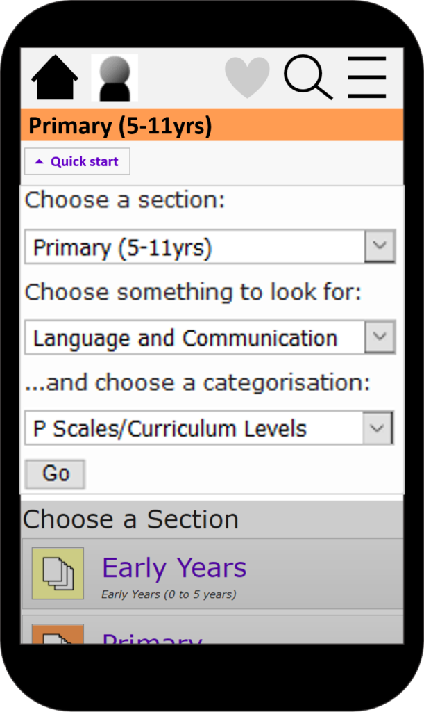
You can select the age range, the type of thing you are looking for, and an alternative scale.
Example of a list of activities
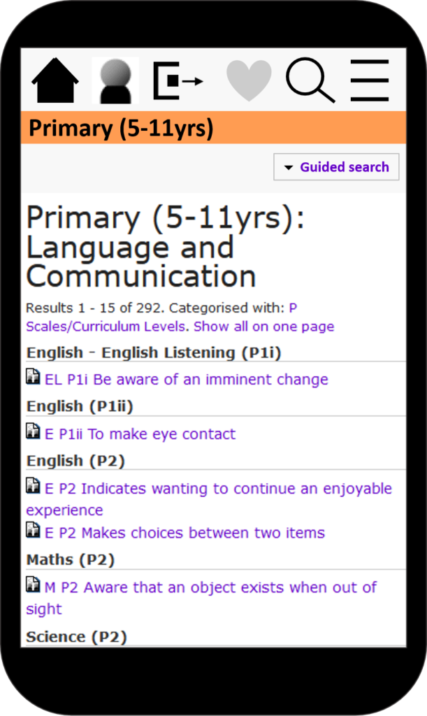
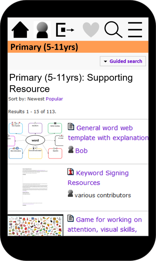
An example of a list of supporting resources
An activities sheet
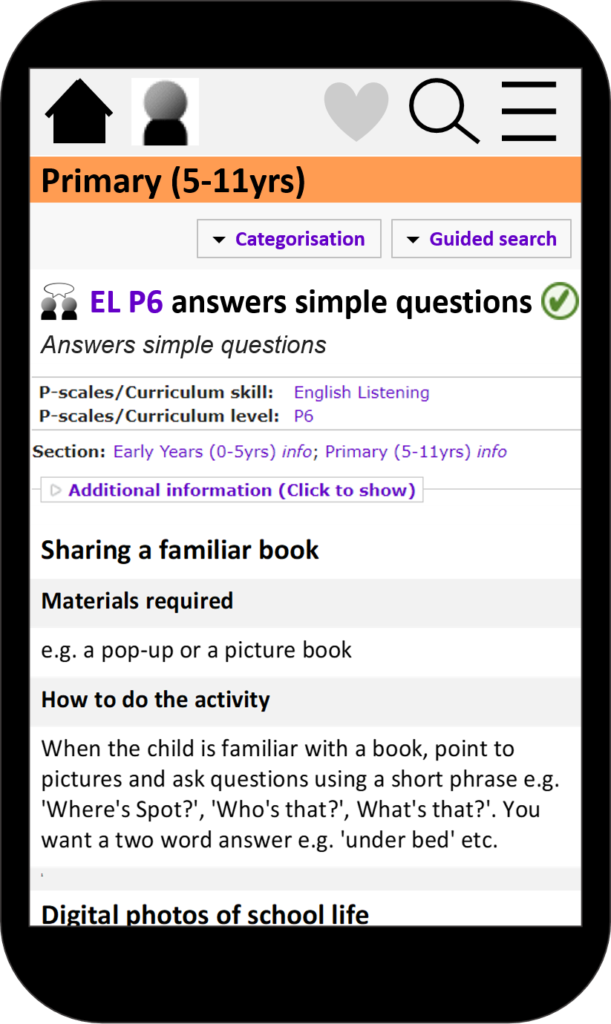
You can change the scale by tapping on “Categorisation”. You can find other activities sheets and resources in the same section (Primary in this example) by tapping on “Guided search”. Tap on the heart icon to add the page to your list of favourites (if you are logged in).
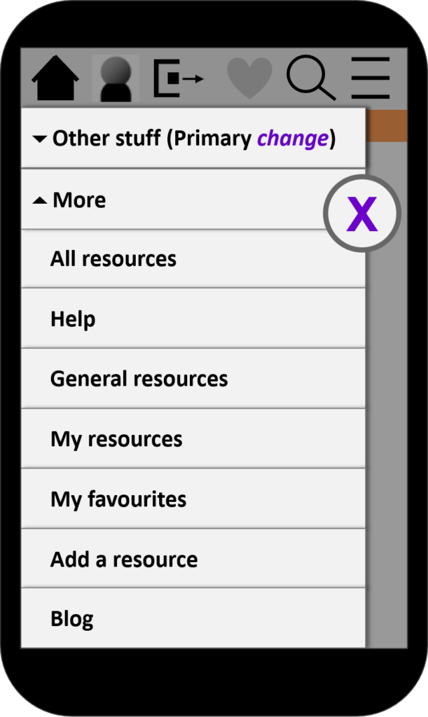
Hamburger menu
When you tap on the “hamburger” icon (three lines at the top right of the screen), you will get a list of links:
What do you think?
Send us your comments